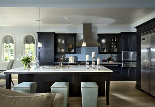
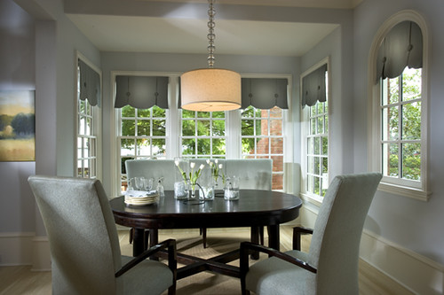
The kitchen and dining room above are both from the same project, and I adore them. Love the light blue against the dark cabinetry in the kitchen. Perfect contrast!
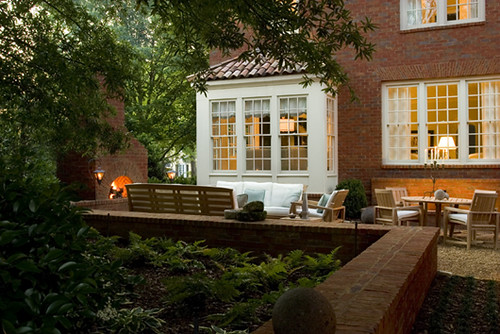
Summer may be slipping away, but this backyard would also be a great place to gather with great friends on a crisp fall evening with some cozy blankets and warm drinks. Hot apple cider anyone?
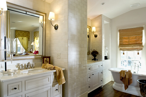
The whole bathroom above is incredible, but the best part has to be that the vanities are completely separated. There would be no invasion of space, no one else's stuff ending up on your side and, my biggest pet peeve, no one else's water splashes to clean up.
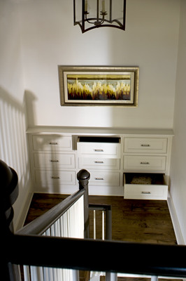
All I can say about this staircase landing is, what an incredible use of otherwise wasted space (plus those floors are beautiful).
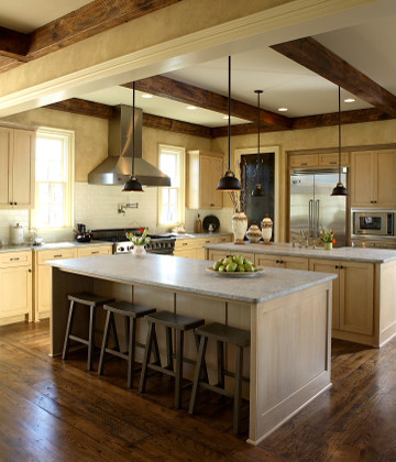
I would be thrilled if our kitchen could look like this one day. It's the perfect combination of rustic and modern for my taste. Saving this one to my personal inspiration files.
Have you come across any inspiring designers recently that we need to know about?
Incase you missed it, don't forget to head to my post from yesterday to enter for your chance to win a free copy of MyMemories Suite 2!
ooh dreamy!
ReplyDeleteHOLY MOLY - I tried to convince my mom to use our staircase landing space in the exact same way (nice white shoe cabinets from Ikea) and she wasn't feeling it. DAMN, I'm showing her this photo. Great post :) Thanks for stopping by my NYC post! x
ReplyDeleteAlso: beauttttttttiful bathroom! can't stop looking.
ReplyDeleteGorgeous spaces! I love reading Mandi's blog too!
ReplyDeleteLove LOVE those built-ins on the landing!
ReplyDeleteso gorgeous! i too love that landing~
ReplyDelete