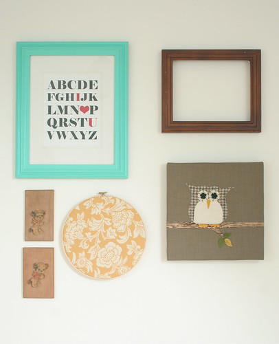
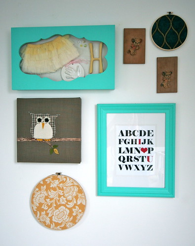
Well, up until last night, it still looked like that. Since switching up the wall was on my 2012 to-do list, and her shadow box was completed, I knew it was time to cross this item off. I stand back and look at it, and think I can still make some tweaks (which I am sure I will), but here is what we have now...
So we removed the empty frame since her H is now in her shadow box. Then we added the shadow box and that little tiny embroidery hoop of fabric at the top. You may recognize it from a previous post I did on some fabric I loved. I ordered three sample and when I held that one in my hand, I knew it would look great on her wall.
So, another item sort of crossed off the list. As I mentioned, I am sure I will continue to tweak it a little. I think our owl is up a little high... and something else needs to be added to the top corner with the puppy plaques, unless I just rearrange how those three things are laid out entirely. Something just seems off - what would you tweak?


I would just keep adding, hon - you're creating such a pretty wall here!
ReplyDeleteyep, i like this wonkier arrangement better. and the bright shadow box you made looks perfect.
ReplyDeletehave you tried putting the two wooden pieces side by side? I really love the shadow box!
ReplyDeleteI LOVE that shadow box!!!
ReplyDeleteAwe, I love it! Great job!
ReplyDeleteWell done! The shadow box is such a sweet addition!
ReplyDelete